
flowchart TD
    A["Variable"] --> B["Categorical"]
    A --> C["Numerical"]
    B --> D["Nominal<br/>no natural order"]
    B --> E["Ordinal<br/>natural order"]
    C --> F["Discrete<br/>countable values"]
    C --> G["Continuous<br/>measured on a continuum"]
Statistics Cheat Sheet
Data, distributions, and visual interpretation
This sheet follows the assigned sections of Introduction to Modern Statistics (2e) (IMS) (Çetinkaya-Rundel and Hardin 2024). The textbook links below work online and in the PDF.
TipThe big idea
Start with the data, not the chart.
Before visualizing anything, ask:
- What does one row represent?
- What variables do I have?
- What type is each variable?
- Am I describing one variable or a relationship?
- What population do I ultimately care about?
1. Data basics
Observations, variables, and data frames
Textbook: IMS § 1.2.1.
Most datasets can be imagined as a table:
| artwork | medium | viewing_time | likes |
|---|---|---|---|
| A | 18.4 | 12 | |
| B | digital | 7.9 | 34 |
| C | 12.1 | 19 |
- Observation / case / observational unit: one thing being studied.
- Usually one row.
- Here: one artwork.
- Variable: a characteristic measured for every observation.
- Usually one column.
- Here:
medium,viewing_time,likes.
- Value: the particular measurement in one cell.
- e.g.
18.4seconds.
- e.g.
A useful question is:
What does one row mean?
If you cannot answer that clearly, you probably do not yet understand the dataset.
Tidy data
A common structure is tidy data:
- one row = one observation
- one column = one variable
- one cell = one value
This structure makes data easier to summarize, visualize, and analyze.
WarningDesign-data trap
A spreadsheet that looks neat to a human is not necessarily tidy data.
For example, using separate columns for Monday, Tuesday, Wednesday, etc. may encode values in column names instead of storing day as a variable.
Types of variables
Textbook: IMS § 1.2.2.
The most important split is:
Numerical variables
Values represent quantities. Differences between them, and summaries such as averages, can be meaningful.
Examples:
- viewing time
- font size
- age
- screen width
- number of visitors
- number of clicks
Discrete numerical
Values come in distinct steps, often because they are counts.
Examples:
- 0, 1, 2, 3 clicks
- number of exhibition visitors
- number of colors used
You cannot normally observe 3.72 visitors.
Continuous numerical
Can theoretically take any value within some interval.
Examples:
- reading time: 4.81 s
- height: 172.3 cm
- temperature
- distance
Measurements may be rounded, but the underlying quantity is continuous.
Categorical variables
Values represent groups or labels.
Examples:
- medium:
print,digital,installation - operating system
- country
- typeface family
- yes/no
ImportantNumbers are not automatically numerical data
A student ID, postcode, telephone number, or room number may contain digits, but averaging them makes no sense.
Ask:
Does arithmetic on these values mean anything?
If not, treat the variable as categorical.
Nominal vs. ordinal
Nominal
Categories have no inherent ranking.
medium = print / web / installation
Ordinal
Categories have a meaningful order.
satisfaction = poor / fair / good / excellent
But the distance between ordinal categories is not necessarily equal.
poor → fair
does not necessarily represent the same change as
good → excellent.
Relationships between variables
Textbook: IMS § 1.2.3.
Often the goal is not to describe one variable but to ask whether two variables are related.
Design examples:
- Does larger text correspond to shorter reading time?
- Do visitors spend more time with larger artworks?
- Is device type related to task completion?
- Does color contrast correspond to higher click-through rates?
Two variables are associated if values of one variable tend to correspond systematically with values of another.
Positive association
As one variable increases, the other tends to increase.
screen size ↑ → time watching video ↑
Negative association
As one increases, the other tends to decrease.
font size ↑ → reading errors ↓
No evident association
Knowing one variable gives little information about the other.
WarningAssociation ≠ causation
A visible relationship does not automatically mean that one variable caused the other.
There might be:
- other variables involved;
- selection effects;
- common causes;
- coincidence.
A plot can show an association. Establishing causality requires an appropriate study design, typically an experiment.
Explanatory and response variables
Textbook: IMS § 1.2.4.
When the research question suggests that one variable may explain or predict another:
Explanatory variable → Response variable
Example:
Does increasing line spacing improve reading speed?
- Explanatory: line spacing
- Response: reading speed
In a scatterplot, the convention is usually:
- explanatory variable → x-axis
- response variable → y-axis
But assigning these labels does not prove causality.
2. Population and sample
Textbook: IMS § 2.1.1.
Population
The population is the complete group you ultimately want to understand.
Example research question:
What is the average time visitors spend in this museum exhibition?
Possible population:
All visitors to the exhibition during its entire run.
Sample
The sample is the set of observations you actually collect.
Example:
180 visitors observed during four selected days.
flowchart TD
    A["Target population"] -->|sampling| B["Sample"]
    B -->|data analysis| C["Description of the sample"]
    C -->|cautious inference| A
Census
A census measures every case in the population.
This is often:
- expensive;
- slow;
- impractical;
- impossible.
So we usually study a sample instead.
ImportantThe sample is not automatically the population
Observing 100 art students does not automatically tell you about all adults.
When reading a statistic, ask:
Who was actually measured, and who is the conclusion supposed to describe?
3. Categorical data: contingency tables & bar plots
Textbook: IMS § 4.1.
Contingency table
Use a contingency table to summarize two categorical variables.
Example: device type and task completion.
| Completed | Not completed | Total | |
|---|---|---|---|
| Mobile | 42 | 18 | 60 |
| Desktop | 32 | 8 | 40 |
| Total | 74 | 26 | 100 |
Each inner cell describes one combination of categories.
For example:
18 mobile users did not complete the task.
The final row and column are marginal totals.
What to look for
Ask whether the distribution of one variable changes depending on the other.
For example:
Is task completion distributed similarly for mobile and desktop users?
The two groups hold different numbers of users, so raw counts can mislead. Convert each row to a proportion of its own total:
Mobile completion:   42 / 60 = 70%
Desktop completion:  32 / 40 = 80%
ImportantCompare proportions, not only counts
When the group sizes differ, compare proportions within each group. Mobile shows more completions than desktop, 42 against 32, but a smaller share of its own users, 70% against 80%.
A contingency table gives the raw material for studying relationships between categorical variables.
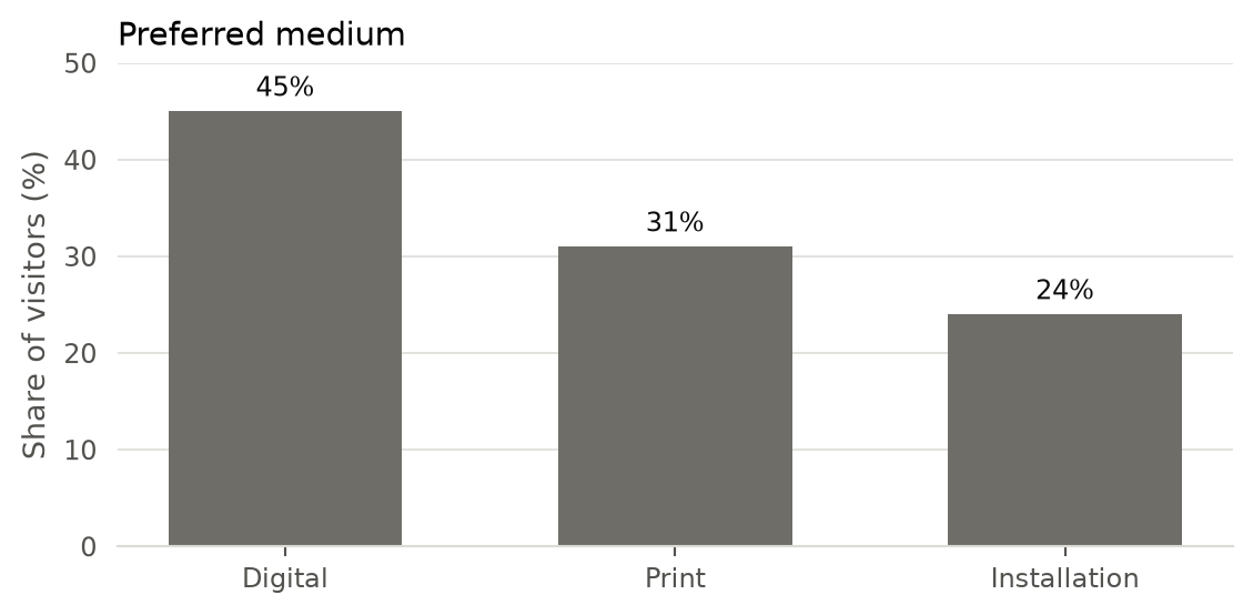
Bar plot
Use a bar plot for a categorical variable.
Bar height can represent:
- count, or
- proportion / percentage.
Example:
Good bar-chart practice
- Start the quantitative axis at zero when bar length represents magnitude.
- Label categories clearly.
- Sort intentionally:
- natural order;
- ascending/descending value;
- meaningful conceptual order.
- Avoid decoration that competes with comparison.
- Use counts when the absolute number matters.
- Use proportions when the share of observations matters.
4. Scatterplots for paired data
Textbook: IMS § 5.1.
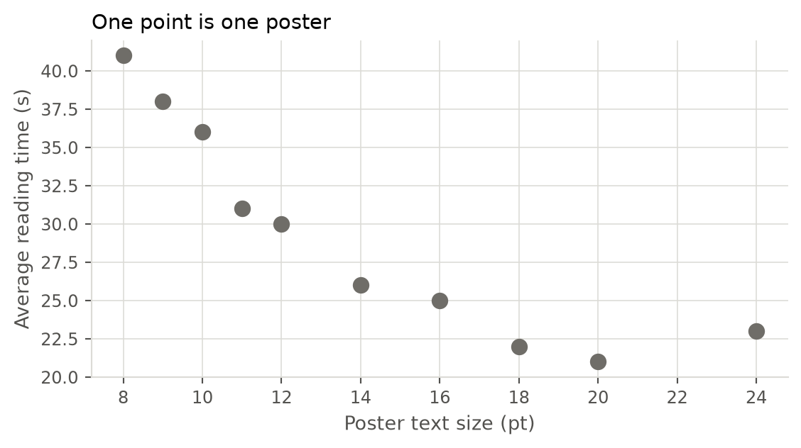
Use a scatterplot when you have two numerical variables measured on the same observations.
Each point = one case.
Example:
- x = poster text size
- y = average reading time
- one point = one poster
Read a scatterplot using four questions
1. Direction
Does \(y\) generally:
- increase as \(x\) increases? → positive
- decrease as \(x\) increases? → negative
- show no clear direction?
2. Form
Is the relationship:
- approximately linear?
- curved / nonlinear?
- clustered?
- something more complicated?
Do not assume every relationship should be a straight line.
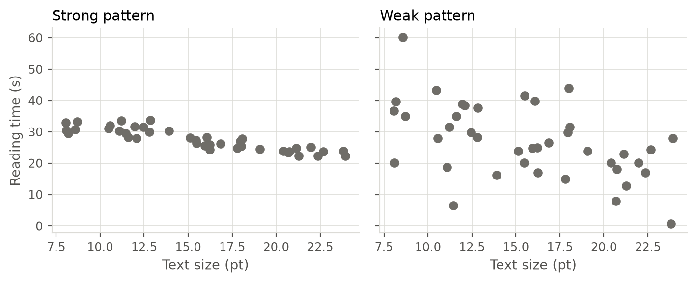
3. Strength
How closely do the points follow the overall pattern?
Compare. Both panels share the same underlying relationship. Only the scatter around it differs.
4. Unusual observations
Look for points far from the main pattern.
They may represent:
- a genuine exceptional case;
- measurement error;
- data-entry error;
- a subgroup worth investigating.
Do not silently delete them.
WarningScatterplot ≠ proof
Even a beautiful, strong relationship only establishes an association from the plot itself.
It does not establish that changing \(x\) will cause \(y\) to change.
Sentence template
As [x] increases, [y] tends to [increase/decrease]. The relationship appears [roughly linear/nonlinear], with [little/substantial] scatter and [no/some] unusual observations.
5. Dot plots and the mean
Textbook: IMS § 5.2.
Dot plot
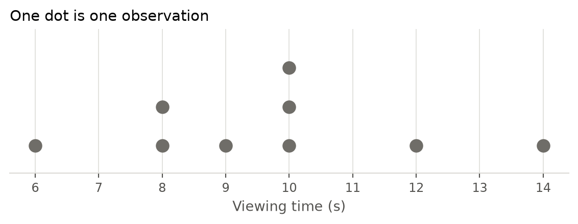
A dot plot displays the distribution of one numerical variable.
Each dot represents an observation.
It works especially well for relatively small datasets because you can still see individual values.
For large datasets, histograms are usually more readable.
Mean
The mean is the arithmetic average and a measure of the center of a distribution.
For observations
\[ x_1,x_2,\ldots,x_n \]
the sample mean is
\[ \bar{x} = \frac{x_1+x_2+\cdots+x_n}{n} = \frac{1}{n}\sum_{i=1}^{n}x_i. \]
Where:
- \(x_i\) = one observed value
- \(n\) = number of observations
- \(\bar{x}\) = sample mean
Example
Five reading times:
\[ 8,\;9,\;10,\;13,\;15 \]
Then
\[ \bar{x} = \frac{8+9+10+13+15}{5} = 11. \]
Average reading time = 11 seconds.
Think of the mean as a balancing point
The mean is not simply “the most common” or “the middle” observation.
It can be imagined as the balance point of the distribution.
The panels below hold the same four small values. Only the last value changes. The mean follows it. The median does not.
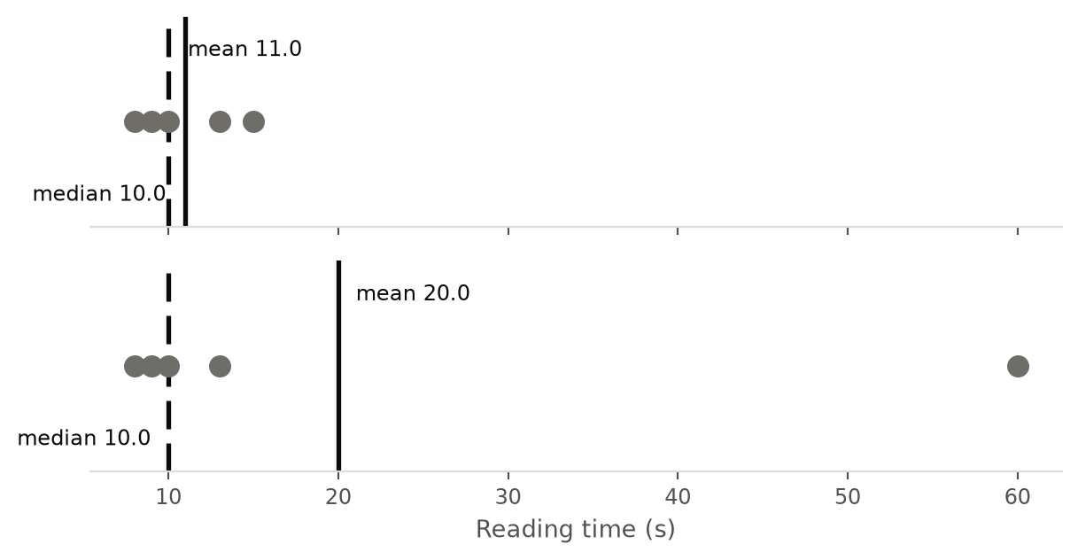
Values far away from the center contribute strongly to where this balancing point lies.
Sample mean vs. population mean
Sample mean:
\[ \bar{x} \]
Population mean:
\[ \mu \]
Usually we cannot measure every case in the population, so we use
\[ \bar{x} \]
as an estimate of
\[ \mu. \]
This step needs an appropriate sampling design. A sample that is not representative gives a sample mean that can sit far from the population mean, however large the sample is.
flowchart BT
    A["Sample mean x̄"] -->|estimates| B["Population mean μ"]
Why means are useful
Means put totals into a common unit.
Instead of:
220 minutes of viewing across 20 visitors
we can say:
\[ \frac{220\text{ min}}{20\text{ visitors}} = 11\text{ min/visitor}. \]
This makes comparisons easier.
Weighted means
Be careful when averaging averages from groups of different sizes.
Suppose:
| Test group | Users | Mean completion time |
|---|---|---|
| A | 10 | 20 s |
| B | 90 | 30 s |
The overall mean is not
\[ \frac{20+30}{2}=25. \]
Group B represents nine times as many users.
Instead:
\[ \bar{x} = \frac{10(20)+90(30)}{100} = 29\text{ s}. \]
WarningCommon mean mistake
Do not give groups equal weight when the groups contain very different numbers of observations.
Ask what each number being averaged actually represents.
6. Histograms and distribution shape
Textbook: IMS § 5.3.
Use a histogram to display the distribution of one numerical variable, especially when there are too many observations for a dot plot.
Instead of drawing each observation separately, values are grouped into intervals called bins.
For equal-width bins, higher bars mean more observations occur in that numerical region.
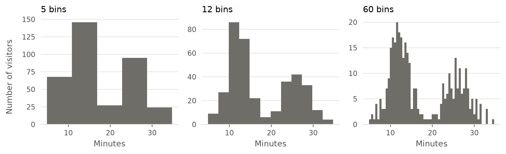
The three panels below show the same 360 visitors. Only the number of bins changes. Five bins flatten the detail. Sixty bins show noise between the bins as if it were structure. Twelve bins show the two groups of visitors most clearly.
WarningThe bin width is a design decision
Nobody measured the bins. Someone chose them. A different choice tells a different story about the same observations.
What a histogram preserves
It helps reveal:
- where observations concentrate;
- overall shape;
- skew;
- peaks / modes;
- approximate center;
- approximate spread;
- unusual regions or gaps.
What it hides
Because observations are grouped into bins, you cannot usually recover the exact individual values.
A histogram is therefore a summary of the distribution, not a case-by-case display.
Shape: symmetric vs. skewed
Symmetric
Both sides trail off in roughly similar ways.
Right-skewed
Long tail points toward higher values.
Often:
- many observations are relatively low;
- a few observations are very high.
Left-skewed
Long tail points toward lower values.
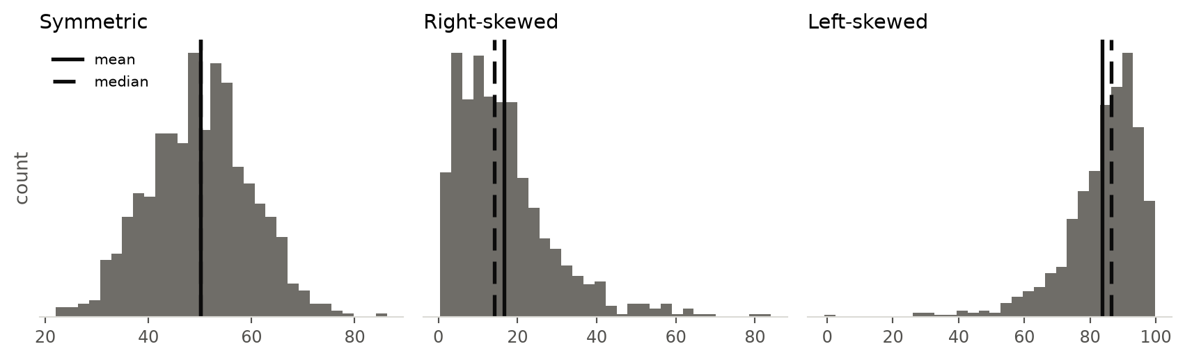
Compare the three shapes. The solid line marks the mean. The dashed line marks the median. Skew pulls the mean into the tail and leaves the median behind.
ImportantName the skew from the tail
Right-skewed does not mean “most observations are on the right.”
It means the long tail points right.
Likewise, left-skewed = long tail to the left.
Modes
A mode is a prominent peak in a distribution.
The useful question is not necessarily:
Which exact value occurs most often?
For numerical data, instead ask:
How many prominent peaks are visible?
- unimodal → one prominent peak
- bimodal → two
- multimodal → more than two
A bimodal distribution may suggest that two different groups have been combined.
Example:
Heights measured from children and adults might produce two peaks.
Description template
The distribution of [variable] is [unimodal/bimodal/multimodal] and [symmetric/right-skewed/left-skewed], with most observations around [region] and [any unusual features].
7. Box plots, quartiles, and the median
Textbook: IMS § 5.5.
Median
First order the observations from smallest to largest.
The median is the value in the middle.
Odd number of observations
2  4  7  8  19
      ↑
    median
Median = 7
Even number of observations
2  4  7  8  19  23
      ↑  ↑
Average the two middle values:
\[ \text{median} = \frac{7+8}{2} = 7.5 \]
The median is also the 50th percentile. It splits the ordered observations into a lower half and an upper half.
Quartiles
Quartiles split an ordered distribution into four parts.
- \(Q_1\) = 25th percentile
- median = 50th percentile
- \(Q_3\) = 75th percentile
flowchart LR
    A["Ordered observations"] --> B["25% below Q1"]
    A --> C["25% from Q1 to the median"]
    A --> D["25% from the median to Q3"]
    A --> E["25% above Q3"]
Approximately:
- 25% below \(Q_1\)
- 25% between \(Q_1\) and median
- 25% between median and \(Q_3\)
- 25% above \(Q_3\)
Interquartile range
The interquartile range (IQR) measures the width of the middle 50%:
\[ IQR = Q_3-Q_1. \]
Large IQR → middle half of observations are spread widely.
Small IQR → middle half are relatively concentrated.
Reading a box plot
The two panels below show the same observations. The histogram shows the shape. The box plot compresses the distribution into quartiles, a median, whiskers, and potential outliers.
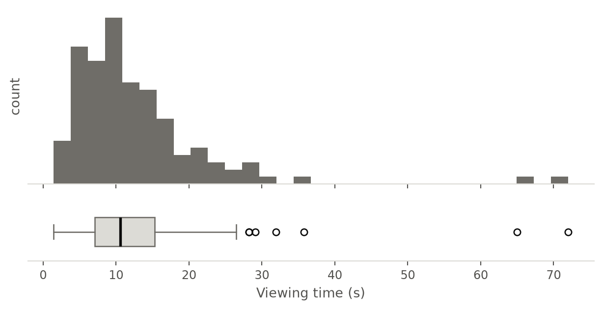
The black line is the median. The open circles beyond the whisker are potential outliers.
The box runs from:
\[ Q_1 \rightarrow Q_3 \]
and therefore contains the middle 50% of observations.
The line inside the box is the median.
Each whisker reaches the most extreme observation that still lies within 1.5 × IQR of the box. Observations beyond those fences are drawn individually as potential outliers.
Potential outliers: the 1.5 × IQR rule
A commonly used rule marks an observation as a potential outlier when it lies below
\[ Q_1-1.5(IQR) \]
or above
\[ Q_3+1.5(IQR). \]
These boundaries are sometimes called fences.
WarningOutlier does not mean error
A point beyond an outlier fence may be:
- an error;
- an unusual but genuine case;
- evidence of skew;
- the most interesting observation in the dataset.
Investigate it before deciding what to do.
Compare groups with side-by-side box plots
Draw one box plot for each category, on a shared numerical axis. This is the standard display for one categorical and one numerical variable.
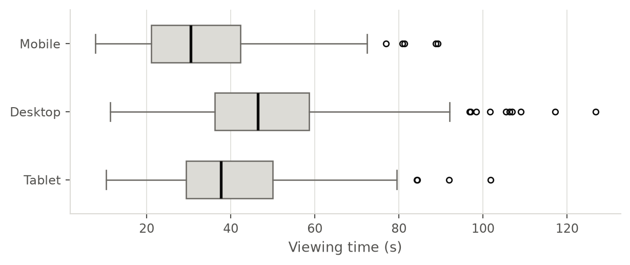
Read it by comparing the medians, then the boxes, then the whiskers and the outliers.
A grouped dot plot works as well when each group holds few observations, because it still shows the individual values.
Bar plot vs. histogram
These are easy to confuse.
| Bar plot | Histogram | |
|---|---|---|
| Variable | Categorical | Numerical |
| Each bar represents | A category | A numerical interval/bin |
| x-axis | Labels | Numerical scale |
| Order | Can often be rearranged | Must follow numerical order |
| Gaps | Usually separated | Usually adjacent |
| Main question | How common is each category? | What is the shape of the distribution? |
Which display should I use?
flowchart TD
    A["What are you trying to describe?"]

    A --> B["1 variable"]
    A --> C["Relationship between 2 variables"]

    B --> D["Categorical"]
    B --> E["Numerical"]

    D --> F["Bar plot"]

    E --> G{"Small enough to<br/>show individual values?"}
    G -->|Yes| H["Dot plot"]
    G -->|No| I["Histogram"]
    E --> J["Box plot<br/>for compact summary"]

    C --> K["2 categorical"]
    C --> L["2 numerical"]
    C --> O["1 categorical<br/>+ 1 numerical"]

    K --> M["Contingency table"]
    L --> N["Scatterplot"]
    O --> P["Side-by-side box plots<br/>or grouped dot plot"]
For one categorical and one numerical variable, ask:
How does the numerical distribution differ across the categories?
For example:
- Does viewing time differ by device type?
- Does completion time differ across task categories?
Fast interpretation checklist
When you see a visualization, ask:
- What is one observation?
- Which variables are shown?
- Are they categorical or numerical?
- What is the population, and what is the sample?
- Is the visualization appropriate for the variable type?
- Where is the center?
- How spread out are the observations?
- What is the shape?
- Are there clusters, gaps, or unusual observations?
- Is the chart showing association, or is someone claiming causation?
Five formulas, symbols, and definitions worth remembering
Sample mean
\[ \boxed{ \bar{x}=\frac{1}{n}\sum_{i=1}^{n}x_i } \]
Population mean
\[ \boxed{\mu} \]
Median
\[ \boxed{\text{50th percentile}} \]
Interquartile range
\[ \boxed{IQR=Q_3-Q_1} \]
Common potential-outlier fences
\[ \boxed{Q_1-1.5IQR} \qquad \boxed{Q_3+1.5IQR} \]
One-minute summary
| Situation | Main idea |
|---|---|
| Dataset | rows = observations; columns = variables |
| Numerical variable | values are quantities; differences and averages can be meaningful |
| Categorical variable | values represent groups |
| Discrete | countable numerical values |
| Continuous | measured along a continuum |
| Population | full group you want to understand |
| Sample | observations you actually have |
| Two categorical variables | contingency table |
| One categorical + one numerical variable | side-by-side box plots |
| One categorical variable | bar plot |
| Two numerical variables | scatterplot |
| Small numerical dataset | dot plot |
| Numerical distribution | histogram |
| Arithmetic center | mean \(\bar{x}\) |
| Middle observation | median |
| Middle 50% | \(Q_1\) to \(Q_3\) |
| Middle-50% spread | IQR |
| Compact distribution summary | box plot |
| Long tail right | right-skewed |
| Long tail left | left-skewed |
| Visible relationship | association |
| Association | not automatically causation |
TipFor information designers
A visualization is not merely decoration applied after analysis.
Choosing between a bar plot, histogram, scatterplot, or box plot is part of the reasoning: each graphic answers a different kind of question and preserves or hides different features of the data.